k-means 알고리즘 작동 그림
K-Means를 이용한 붓꽃(Iris) 데이터 셋 Clustering
from sklearn.preprocessing import scale
from sklearn.datasets import load_iris
from sklearn.cluster import KMeans
import matplotlib.pyplot as plt
import numpy as np
import pandas as pd
%matplotlib inline

iris = load_iris()
# 보다 편리한 데이터 Handling을 위해 DataFrame으로 변환
irisDF = pd.DataFrame(data=iris.data, columns=['sepal_length','sepal_width','petal_length','petal_width'])
irisDF.head(3)
| sepal_length | sepal_width | petal_length | petal_width | |
|---|---|---|---|---|
| 0 | 5.1 | 3.5 | 1.4 | 0.2 |
| 1 | 4.9 | 3.0 | 1.4 | 0.2 |
| 2 | 4.7 | 3.2 | 1.3 | 0.2 |
# 개정판 소스 코드 수정(2019.12.24)
kmeans = KMeans(n_clusters=3, init='k-means++', max_iter=300,random_state=0)        # 전체 붓꽃 클래스가 3개이므로 군집화 수를 3으로 지정
kmeans.fit(irisDF)
KMeans(n_clusters=3, random_state=0)
print(kmeans.labels_)
[1 1 1 1 1 1 1 1 1 1 1 1 1 1 1 1 1 1 1 1 1 1 1 1 1 1 1 1 1 1 1 1 1 1 1 1 1
 1 1 1 1 1 1 1 1 1 1 1 1 1 0 0 2 0 0 0 0 0 0 0 0 0 0 0 0 0 0 0 0 0 0 0 0 0
 0 0 0 2 0 0 0 0 0 0 0 0 0 0 0 0 0 0 0 0 0 0 0 0 0 0 2 0 2 2 2 2 0 2 2 2 2
 2 2 0 0 2 2 2 2 0 2 0 2 0 2 2 0 0 2 2 2 2 2 0 2 2 2 2 0 2 2 2 0 2 2 2 0 2
 2 0]
- 군집 중심점 좌표 시각화 가능
- column 수가 4개이므로 각 클래스의 좌표가 4개로 이루어진 것을 아래 코드를 통해 확인
kmeans.cluster_centers_
array([[5.9016129 , 2.7483871 , 4.39354839, 1.43387097],
       [5.006     , 3.428     , 1.462     , 0.246     ],
       [6.85      , 3.07368421, 5.74210526, 2.07105263]])
# irisDF['cluster']=kmeans.labels_ 개정 소스코드 변경(2019.12.24)

irisDF['target'] = iris.target
irisDF['cluster']=kmeans.labels_
iris_result = irisDF.groupby(['target','cluster'])['sepal_length'].count()
print(iris_result)
target  cluster
0       1          50
1       0          48
        2           2
2       0          14
        2          36
Name: sepal_length, dtype: int64
- 위 결과에서 짚고 넘어가야할 점
- 클러스터링의 넘버링은 상관없다 (단지 그룹핑만 원할하게 잘 되면 됨)
- 위 결과에서 target 0에 대해서는 군집화가 성공적으로 잘 된 것이고 target 2는 군집화가 잘 안된것임
- 클러스터링의 넘버링은 상관없다 (단지 그룹핑만 원할하게 잘 되면 됨)
2차원 시각화 진행
- 데이터 속성이 4개이므로 PCA를 활용해서 데이터 속성을 2개로 줄임
from sklearn.decomposition import PCA

pca = PCA(n_components=2)
pca_transformed = pca.fit_transform(iris.data)

irisDF['pca_x'] = pca_transformed[:,0]
irisDF['pca_y'] = pca_transformed[:,1]
irisDF.head(3)
| sepal_length | sepal_width | petal_length | petal_width | target | cluster | pca_x | pca_y | |
|---|---|---|---|---|---|---|---|---|
| 0 | 5.1 | 3.5 | 1.4 | 0.2 | 0 | 1 | -2.684126 | 0.319397 |
| 1 | 4.9 | 3.0 | 1.4 | 0.2 | 0 | 1 | -2.714142 | -0.177001 |
| 2 | 4.7 | 3.2 | 1.3 | 0.2 | 0 | 1 | -2.888991 | -0.144949 |
내 방식대로 2차원 그래프에 표현해보기
cluster_0 = irisDF.loc[irisDF['cluster'] == 0, ]
cluster_1 = irisDF.loc[irisDF['cluster'] == 1, ]
cluster_2 = irisDF.loc[irisDF['cluster'] == 2, ]

plt.plot(cluster_0['pca_x'], cluster_0['pca_y'], 'ro')
plt.plot(cluster_1['pca_x'], cluster_1['pca_y'], 's')
plt.plot(cluster_2['pca_x'], cluster_2['pca_y'], '^')
plt.show()
# cluster_0 = irisDF.iloc[0:2, 0:1]
교재에 있는 코드
- 전체를 담고있는 irisDF의 index를 활용해서 접근함
- 나는 판다스 데이터프레임을 3개 기억해두고 그릴 때 저장된 데이터프레임을 활용했음
- 교재처럼 하는 방식의 메모리 절약에 더 도움이 될것으로 보임
# cluster 값이 0, 1, 2 인 경우마다 별도의 Index로 추출
marker0_ind = irisDF[irisDF['cluster']==0].index
marker1_ind = irisDF[irisDF['cluster']==1].index
marker2_ind = irisDF[irisDF['cluster']==2].index

# cluster값 0, 1, 2에 해당하는 Index로 각 cluster 레벨의 pca_x, pca_y 값 추출. o, s, ^ 로 marker 표시
plt.scatter(x=irisDF.loc[marker0_ind,'pca_x'], y=irisDF.loc[marker0_ind,'pca_y'], marker='o')
plt.scatter(x=irisDF.loc[marker1_ind,'pca_x'], y=irisDF.loc[marker1_ind,'pca_y'], marker='s')
plt.scatter(x=irisDF.loc[marker2_ind,'pca_x'], y=irisDF.loc[marker2_ind,'pca_y'], marker='^')

plt.xlabel('PCA 1')
plt.ylabel('PCA 2')
plt.title('3 Clusters Visualization by 2 PCA Components')
plt.show()
- 파랑, 초록색의 군집화는 주황색만큼 명확하지는 않음
Clustering 알고리즘 테스트를 위한 데이터 생성
import numpy as np
import matplotlib.pyplot as plt
from sklearn.cluster import KMeans
from sklearn.datasets import make_blobs
%matplotlib inline

X, y = make_blobs(n_samples=200, n_features=2, centers=3, cluster_std=0.8, random_state=0)      # cluster_std를 통해 데이터 퍼진 정도를 조절할 수 있음
print(X.shape, y.shape)

# y target 값의 분포를 확인
unique, counts = np.unique(y, return_counts=True)
print(unique,counts)
(200, 2) (200,)
[0 1 2] [67 67 66]
import pandas as pd

clusterDF = pd.DataFrame(data=X, columns=['ftr1', 'ftr2'])
clusterDF['target'] = y
clusterDF.head(3)
| ftr1 | ftr2 | target | |
|---|---|---|---|
| 0 | -1.692427 | 3.622025 | 2 |
| 1 | 0.697940 | 4.428867 | 0 |
| 2 | 1.100228 | 4.606317 | 0 |
target_list = np.unique(y)
# 각 target별 scatter plot 의 marker 값들.
markers=['o', 's', '^', 'P','D','H','x']
# 3개의 cluster 영역으로 구분한 데이터 셋을 생성했으므로 target_list는 [0,1,2]
# target==0, target==1, target==2 로 scatter plot을 marker별로 생성.
for target in target_list:
    target_cluster = clusterDF[clusterDF['target']==target]
    plt.scatter(x=target_cluster['ftr1'], y=target_cluster['ftr2'], edgecolor='k', marker=markers[target] )
plt.show()
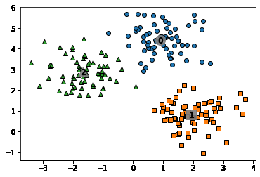
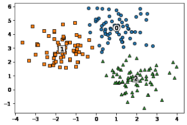
# KMeans 객체를 이용하여 X 데이터를 K-Means 클러스터링 수행
kmeans = KMeans(n_clusters=3, init='k-means++', max_iter=200, random_state=0)
cluster_labels = kmeans.fit_predict(X)
clusterDF['kmeans_label']  = cluster_labels

#cluster_centers_ 는 개별 클러스터의 중심 위치 좌표 시각화를 위해 추출
centers = kmeans.cluster_centers_
unique_labels = np.unique(cluster_labels)
markers=['o', 's', '^', 'P','D','H','x']

# 군집된 label 유형별로 iteration 하면서 marker 별로 scatter plot 수행.
for label in unique_labels:
    label_cluster = clusterDF[clusterDF['kmeans_label']==label]
    center_x_y = centers[label]
    plt.scatter(x=label_cluster['ftr1'], y=label_cluster['ftr2'], edgecolor='k',
                marker=markers[label] )

    # 군집별 중심 위치 좌표 시각화
    plt.scatter(x=center_x_y[0], y=center_x_y[1], s=200, color='white',
                alpha=0.9, edgecolor='k', marker=markers[label])
    plt.scatter(x=center_x_y[0], y=center_x_y[1], s=70, color='k', edgecolor='k',
                marker='$%d$' % label)

plt.show()

# clusterDF.groupby('target').describe()
print(clusterDF.groupby('target')['kmeans_label'].value_counts())
# print(clusterDF.groupby('target')['kmeans_label'].count())
target  kmeans_label
0       0               66
        1                1
1       2               67
2       1               65
        2                1
Name: kmeans_label, dtype: int64
- 언뜻보면 군집과 분류는 비슷해보임
- 하지만 별도의 군집이 생성되거나, 다른 분류값이여도 군집화 레벨에서는 같은 군집으로 이루어질 수 있어서 다른 개념임
군집평가(Cluster Evaluation)
- 실루엣 분석
- -1 ~ 1 의 범위를 갖는 실루엣 계수를 활용해 진행
- \[s(i) = {(b(i) - a(i)) \over (max(a(i), b(i))}\]
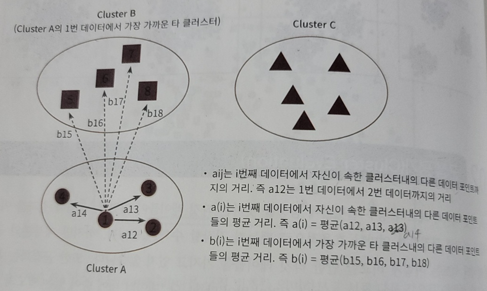
- -1 ~ 1 의 범위를 갖는 실루엣 계수를 활용해 진행
붓꽃(Iris) 데이터 셋을 이용한 클러스터 평가
from sklearn.preprocessing import scale
from sklearn.datasets import load_iris
from sklearn.cluster import KMeans
# 실루엣 분석 metric 값을 구하기 위한 API 추가
from sklearn.metrics import silhouette_samples, silhouette_score
import matplotlib.pyplot as plt
import numpy as np
import pandas as pd

%matplotlib inline

iris = load_iris()
feature_names = ['sepal_length','sepal_width','petal_length','petal_width']
irisDF = pd.DataFrame(data=iris.data, columns=feature_names)
kmeans = KMeans(n_clusters=3, init='k-means++', max_iter=300,random_state=0).fit(irisDF)

irisDF['cluster'] = kmeans.labels_

# iris 의 모든 개별 데이터에 실루엣 계수값을 구함.
score_samples = silhouette_samples(iris.data, irisDF['cluster'])
print('silhouette_samples( ) return 값의 shape' , score_samples.shape)

# irisDF에 실루엣 계수 컬럼 추가
irisDF['silhouette_coeff'] = score_samples

# 모든 데이터의 평균 실루엣 계수값을 구함.
average_score = silhouette_score(iris.data, irisDF['cluster'])
print('붓꽃 데이터셋 Silhouette Analysis Score:{0:.3f}'.format(average_score))

irisDF.head(3)
silhouette_samples( ) return 값의 shape (150,)
붓꽃 데이터셋 Silhouette Analysis Score:0.553
| sepal_length | sepal_width | petal_length | petal_width | cluster | silhouette_coeff | |
|---|---|---|---|---|---|---|
| 0 | 5.1 | 3.5 | 1.4 | 0.2 | 1 | 0.852955 |
| 1 | 4.9 | 3.0 | 1.4 | 0.2 | 1 | 0.815495 |
| 2 | 4.7 | 3.2 | 1.3 | 0.2 | 1 | 0.829315 |
- 위 head()를 통한 데이터 프레임을 보면 cluster 레이블이 1인 값들의 계수들은 모두 높으나 평균 실루엣 계수값이 0.553이다. 이는 다른 군집들간의 거리가 가깝기 때문으로 생각된다
군집별 실루엣계수 평균 출력하기
내 코드
irisDF[irisDF['cluster'] == 0]['silhouette_coeff'].mean(), irisDF[irisDF['cluster'] == 1]['silhouette_coeff'].mean(), irisDF[irisDF['cluster'] == 2]['silhouette_coeff'].mean()
(0.4173199215409327, 0.7981404884286225, 0.4511050604340126)
교재 코드
- cluster의 각각의 값에서 통계 혹은 집계결과를 알고 싶다!?
- groupby를 사용할 것
irisDF.groupby('cluster').describe()
| sepal_length | sepal_width | ... | petal_width | silhouette_coeff | |||||||||||||||||
|---|---|---|---|---|---|---|---|---|---|---|---|---|---|---|---|---|---|---|---|---|---|
| count | mean | std | min | 25% | 50% | 75% | max | count | mean | ... | 75% | max | count | mean | std | min | 25% | 50% | 75% | max | |
| cluster | |||||||||||||||||||||
| 0 | 62.0 | 5.901613 | 0.466410 | 4.9 | 5.600 | 5.9 | 6.2 | 7.0 | 62.0 | 2.748387 | ... | 1.575 | 2.4 | 62.0 | 0.417320 | 0.174364 | 0.026359 | 0.287179 | 0.464160 | 0.584901 | 0.630641 |
| 1 | 50.0 | 5.006000 | 0.352490 | 4.3 | 4.800 | 5.0 | 5.2 | 5.8 | 50.0 | 3.428000 | ... | 0.300 | 0.6 | 50.0 | 0.798140 | 0.049954 | 0.639000 | 0.777809 | 0.811983 | 0.831515 | 0.853905 |
| 2 | 38.0 | 6.850000 | 0.494155 | 6.1 | 6.425 | 6.7 | 7.2 | 7.9 | 38.0 | 3.073684 | ... | 2.300 | 2.5 | 38.0 | 0.451105 | 0.146517 | 0.053286 | 0.401253 | 0.489645 | 0.558825 | 0.613247 |
3 rows × 40 columns
irisDF.groupby('cluster')['silhouette_coeff'].mean()
cluster
0    0.417320
1    0.798140
2    0.451105
Name: silhouette_coeff, dtype: float64
클러스터별 평균 실루엣 계수의 시각화를 통한 클러스터 개수 최적화 방법
### 여러개의 클러스터링 갯수를 List로 입력 받아 각각의 실루엣 계수를 면적으로 시각화한 함수 작성
def visualize_silhouette(cluster_lists, X_features):

    from sklearn.datasets import make_blobs
    from sklearn.cluster import KMeans
    from sklearn.metrics import silhouette_samples, silhouette_score

    import matplotlib.pyplot as plt
    import matplotlib.cm as cm
    import math

    # 입력값으로 클러스터링 갯수들을 리스트로 받아서, 각 갯수별로 클러스터링을 적용하고 실루엣 개수를 구함
    n_cols = len(cluster_lists)

    # plt.subplots()으로 리스트에 기재된 클러스터링 수만큼의 sub figures를 가지는 axs 생성
    fig, axs = plt.subplots(figsize=(4*n_cols, 4), nrows=1, ncols=n_cols)

    # 리스트에 기재된 클러스터링 갯수들을 차례로 iteration 수행하면서 실루엣 개수 시각화
    for ind, n_cluster in enumerate(cluster_lists):

        # KMeans 클러스터링 수행하고, 실루엣 스코어와 개별 데이터의 실루엣 값 계산.
        clusterer = KMeans(n_clusters = n_cluster, max_iter=500, random_state=0)
        cluster_labels = clusterer.fit_predict(X_features)

        sil_avg = silhouette_score(X_features, cluster_labels)
        sil_values = silhouette_samples(X_features, cluster_labels)

        y_lower = 10
        axs[ind].set_title('Number of Cluster : '+ str(n_cluster)+'\n' \
                          'Silhouette Score :' + str(round(sil_avg,3)) )
        axs[ind].set_xlabel("The silhouette coefficient values")
        axs[ind].set_ylabel("Cluster label")
        axs[ind].set_xlim([-0.1, 1])
        axs[ind].set_ylim([0, len(X_features) + (n_cluster + 1) * 10])
        axs[ind].set_yticks([])  # Clear the yaxis labels / ticks
        axs[ind].set_xticks([0, 0.2, 0.4, 0.6, 0.8, 1])

        # 클러스터링 갯수별로 fill_betweenx( )형태의 막대 그래프 표현.
        for i in range(n_cluster):
            ith_cluster_sil_values = sil_values[cluster_labels==i]
            ith_cluster_sil_values.sort()

            size_cluster_i = ith_cluster_sil_values.shape[0]
            y_upper = y_lower + size_cluster_i

            color = cm.nipy_spectral(float(i) / n_cluster)
            axs[ind].fill_betweenx(np.arange(y_lower, y_upper), 0, ith_cluster_sil_values, \
                                facecolor=color, edgecolor=color, alpha=0.7)
            axs[ind].text(-0.05, y_lower + 0.5 * size_cluster_i, str(i))
            y_lower = y_upper + 10

        axs[ind].axvline(x=sil_avg, color="red", linestyle="--")
# make_blobs 을 통해 clustering 을 위한 4개의 클러스터 중심의 500개 2차원 데이터 셋 생성
from sklearn.datasets import make_blobs
X, y = make_blobs(n_samples=500, n_features=2, centers=4, cluster_std=1, \
center_box=(-10.0, 10.0), shuffle=True, random_state=1)
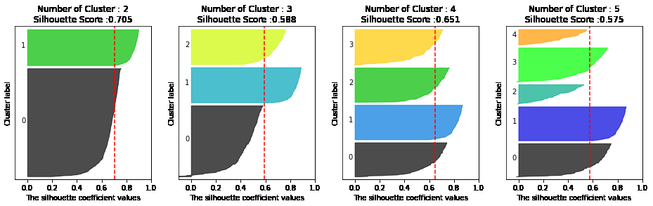
# cluster 개수를 2개, 3개, 4개, 5개 일때의 클러스터별 실루엣 계수 평균값을 시각화
visualize_silhouette([ 2, 3, 4, 5], X)
from sklearn.datasets import load_iris

iris=load_iris()
visualize_silhouette([ 2, 3, 4,5 ], iris.data)
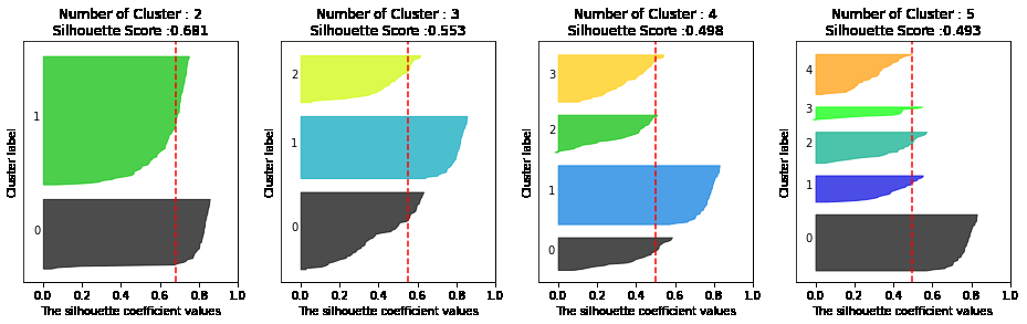
- 위와 같이 실루엣 계수를 통해 K-means의 적절한 군집화 갯수를 추론해볼 수 있음
- 데이터 수가 늘어날수록 연산량이 굉장히 커지기 때문에 개인 pc에서 하기에는 부적합
평균이동(Mean shift)
이해를 위해 필요한 개념
알고리즘 작동과정
- 밀도가 높은 방향으로 중심점이 옮겨다니며 군집을 형성시킴
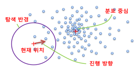
장점
- 데이터 세트 형태를 특정 형태로 가정하거나, 특정 분포도 기반의 모델로 가정하지 않기 때문에 좀더 유연한 군집화가 가능함
- 내가 드는 의문
- KDE도 결국 특정 분포를 가진 커널함수(가우시안 등)를 사용해서 분포를 추정하는것이니 특정 형태로 가정한다고 말은 할 수 있는 것 아닌가? 모든 데이터에 대해 커널함수를 적용하고 합쳐서 스케일링을 진행하기 때문에 그냥 분포를 가정하는것보다 영향력이 줄어들 것 같기는 함..
- 내가 드는 의문
단점
- 알고리즘 수행시간 오래걸림
- band-width의 크기에 따른 군집도 영향이 매우 큼
Mean Shift 코드를 통한 이해
import numpy as np
from sklearn.datasets import make_blobs
from sklearn.cluster import MeanShift

X, y = make_blobs(n_samples=200, n_features=2, centers=3, cluster_std=0.7, random_state=0)      # 표준편차, 특징, 샘플수, 군집수 등 군집화를 위한 데이터 생성해주는 함수

meanshift = MeanShift(bandwidth=0.8)        # bandwidth는 kde의 h와 같은 역할을 하며 bandwidth가 클수록 군집개수가 적어짐
cluster_labels = meanshift.fit_predict(X)
print(f'Cluster labels 유형: {np.unique(cluster_labels)}')
Cluster labels 유형: [0 1 2 3 4 5]
- 너무 세분화된 듯 하여 bandwidth 값을 높여서 군집 줄여보자
- bandwidth가 meanshfit 군집화에서 중요하며 이를 위한 라이브러리를 scikit-learn에서 제공한다
meanshift= MeanShift(bandwidth=1)
cluster_labels = meanshift.fit_predict(X)
print('cluster labels 유형:', np.unique(cluster_labels))
cluster labels 유형: [0 1 2]
from sklearn.cluster import estimate_bandwidth

bandwidth = estimate_bandwidth(X)
print('bandwidth 값:', round(bandwidth,3))
bandwidth 값: 1.816
import pandas as pd


clusterDF = pd.DataFrame(data=X, columns=['ftr1', 'ftr2'])
clusterDF['target'] = y

# estimate_bandwidth()로 최적의 bandwidth 계산
best_bandwidth = estimate_bandwidth(X)

meanshift= MeanShift(bandwidth=best_bandwidth)
cluster_labels = meanshift.fit_predict(X)
print('cluster labels 유형:',np.unique(cluster_labels))
cluster labels 유형: [0 1 2]
meanshift.cluster_centers_
array([[ 0.91576801,  4.43718522],
       [ 1.93418334,  0.80590247],
       [-1.67292851,  2.87796673]])
import matplotlib.pyplot as plt
%matplotlib inline

clusterDF['meanshift_label']  = cluster_labels
centers = meanshift.cluster_centers_
unique_labels = np.unique(cluster_labels)
markers=['o', 's', '^', 'x', '*']

for label in unique_labels:
    label_cluster = clusterDF[clusterDF['meanshift_label']==label]
    center_x_y = centers[label]
    # 군집별로 다른 마커로 산점도 적용
    plt.scatter(x=label_cluster['ftr1'], y=label_cluster['ftr2'], edgecolor='k', marker=markers[label] )

    # 군집별 중심 표현
    plt.scatter(x=center_x_y[0], y=center_x_y[1], s=200, color='gray', alpha=0.9, marker=markers[label])
    plt.scatter(x=center_x_y[0], y=center_x_y[1], s=70, color='k', edgecolor='k', marker='$%d$' % label)

plt.show()
print(clusterDF.groupby('target')['meanshift_label'].value_counts())
print(clusterDF.groupby('target')['meanshift_label'].count())
target  meanshift_label
0       0                  67
1       1                  67
2       2                  66
Name: meanshift_label, dtype: int64
target
0    67
1    67
2    66
Name: meanshift_label, dtype: int64
clusterDF.groupby('target')['meanshift_label'].value_counts()
target  meanshift_label
0       0                  67
1       1                  67
2       2                  66
Name: meanshift_label, dtype: int64
- 1대1로 굉장히 잘 매칭된 모습을 확인할 수 있다
# clusterDF.groupby('target').count()
clusterDF['meanshift_label'].value_counts()
0    67
1    67
2    66
Name: meanshift_label, dtype: int64
clusterDF.groupby('target').get_group(1)
| ftr1 | ftr2 | target | meanshift_label | |
|---|---|---|---|---|
| 6 | 2.420013 | 0.494612 | 1 | 1 |
| 7 | 1.706645 | 2.248336 | 1 | 1 |
| 16 | 2.605697 | 0.571170 | 1 | 1 |
| 17 | 2.154635 | 0.674134 | 1 | 1 |
| 21 | 1.533939 | 0.319157 | 1 | 1 |
| ... | ... | ... | ... | ... |
| 193 | 1.492881 | 0.414979 | 1 | 1 |
| 194 | 1.245940 | 1.444502 | 1 | 1 |
| 195 | 2.843913 | 0.141712 | 1 | 1 |
| 197 | 2.692393 | 1.119716 | 1 | 1 |
| 199 | 1.547349 | -0.070691 | 1 | 1 |
67 rows × 4 columns
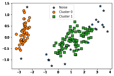
DBSCAN
- 아래와 같이 내부의 원 모양과 외부의 원 모양 형태의 분포를 가진 데이터를 군집화한다고 가정할 때 K means, mean-shift, GMM 으로는 효과적 군집화를 수행하기 어려움
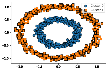
- DBSCAN은 복잡한 기하학적 분포도를 가진 데이터 세트에 대해 군집화를 잘 수행함
DBSCAN 적용하기 – 붓꽃 데이터 셋
from sklearn.datasets import load_iris

import matplotlib.pyplot as plt
import numpy as np
import pandas as pd
%matplotlib inline

iris = load_iris()
feature_names = ['sepal_length','sepal_width','petal_length','petal_width']

# 보다 편리한 데이타 Handling을 위해 DataFrame으로 변환
irisDF = pd.DataFrame(data=iris.data, columns=feature_names)
irisDF['target'] = iris.target
- DBSCAN 클러스터링 함수는 아래와 같은 입력인자가 필요함
- 입실론 영역
- 최소 데이터 갯수
- 입실론 영역내의 최소 데이터 갯수와 입실론 영역내에 있는 데이터 포인트의 종류에 따라 현재 데이터 포인트가
- Core Point
- Neighbor Point
- Border Point
- Noise Point 로 나뉨
- 입실론 영역내의 최소 데이터 갯수와 입실론 영역내에 있는 데이터 포인트의 종류에 따라 현재 데이터 포인트가
from sklearn.cluster import DBSCAN

dbscan = DBSCAN(eps=0.6, min_samples=8, metric='euclidean')
dbscan_labels = dbscan.fit_predict(iris.data)

irisDF['dbscan_cluster'] = dbscan_labels
irisDF['target'] = iris.target

iris_result = irisDF.groupby(['target'])['dbscan_cluster'].value_counts()
print(iris_result)
target  dbscan_cluster
0        0                49
        -1                 1
1        1                46
        -1                 4
2        1                42
        -1                 8
Name: dbscan_cluster, dtype: int64
- DBSCAN으로 군집화를 진행했을 때 붓꽃 데이터의 군집이 2개 형성된 것을 볼 수 있다
- 이는 DBSCAN의 군집화 성능이 떨어진다고 볼 수 없다
- 저자의 말에 따르면 붓꽃 데이터 세트는 군집을 2개로 나누는것이 군집화의 효율로서 더 좋은 면이 있다고 한다
### 클러스터 결과를 담은 DataFrame과 사이킷런의 Cluster 객체등을 인자로 받아 클러스터링 결과를 시각화하는 함수
def visualize_cluster_plot(clusterobj, dataframe, label_name, iscenter=True):
    if iscenter :
        centers = clusterobj.cluster_centers_

    unique_labels = np.unique(dataframe[label_name].values)
    markers=['o', 's', '^', 'x', '*']
    isNoise=False

    for label in unique_labels:
        label_cluster = dataframe[dataframe[label_name]==label]
        if label == -1:
            cluster_legend = 'Noise'
            isNoise=True
        else :
            cluster_legend = 'Cluster '+str(label)

        plt.scatter(x=label_cluster['ftr1'], y=label_cluster['ftr2'], s=70,\
                    edgecolor='k', marker=markers[label], label=cluster_legend)

        if iscenter:
            center_x_y = centers[label]
            plt.scatter(x=center_x_y[0], y=center_x_y[1], s=250, color='white',
                        alpha=0.9, edgecolor='k', marker=markers[label])
            plt.scatter(x=center_x_y[0], y=center_x_y[1], s=70, color='k',\
                        edgecolor='k', marker='$%d$' % label)
    if isNoise:
        legend_loc='upper center'
    else: legend_loc='upper right'

    plt.legend(loc=legend_loc)
    plt.show()
from sklearn.decomposition import PCA
# 2차원으로 시각화하기 위해 PCA n_componets=2로 피처 데이터 세트 변환
pca = PCA(n_components=2, random_state=0)
pca_transformed = pca.fit_transform(iris.data)
# visualize_cluster_2d( ) 함수는 ftr1, ftr2 컬럼을 좌표에 표현하므로 PCA 변환값을 해당 컬럼으로 생성
irisDF['ftr1'] = pca_transformed[:,0]
irisDF['ftr2'] = pca_transformed[:,1]

visualize_cluster_plot(dbscan, irisDF, 'dbscan_cluster', iscenter=False)

visualize_cluster_plot(dbscan, irisDF, 'dbscan_cluster', iscenter=False)
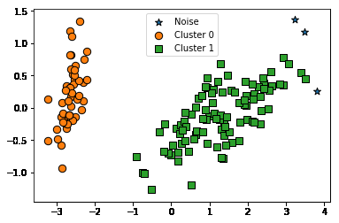
from sklearn.cluster import DBSCAN

dbscan = DBSCAN(eps=0.8, min_samples=8, metric='euclidean')
dbscan_labels = dbscan.fit_predict(iris.data)

irisDF['dbscan_cluster'] = dbscan_labels
irisDF['target'] = iris.target

iris_result = irisDF.groupby(['target'])['dbscan_cluster'].value_counts()
print(iris_result)

visualize_cluster_plot(dbscan, irisDF, 'dbscan_cluster', iscenter=False)
target  dbscan_cluster
0        0                50
1        1                50
2        1                47
        -1                 3
Name: dbscan_cluster, dtype: int64
dbscan = DBSCAN(eps=0.6, min_samples=16, metric='euclidean')
dbscan_labels = dbscan.fit_predict(iris.data)

irisDF['dbscan_cluster'] = dbscan_labels
irisDF['target'] = iris.target

iris_result = irisDF.groupby(['target'])['dbscan_cluster'].value_counts()
print(iris_result)
visualize_cluster_plot(dbscan, irisDF, 'dbscan_cluster', iscenter=False)
target  dbscan_cluster
0        0                48
        -1                 2
1        1                44
        -1                 6
2        1                36
        -1                14
Name: dbscan_cluster, dtype: int64
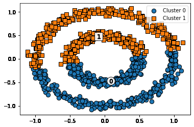
결론
-
K-means는 군집이 원형으로 되어있을 경우 효과적
-
만약 K-means를 원형의 군집데이터가 아니라 다른 형태의 데이터에 적용할 경우
- 실제 정답
- K-means 결과
- 위와 같은 데이터 형태에는 Meanshift, GMM등의 방법을 쓰는것이 더 좋다
- 실제 정답
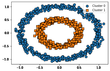
make_circles 데이터와 군집화 알고리즘 적용 모습 비교
Ground Truth
from sklearn.datasets import make_circles

X, y = make_circles(n_samples=1000, shuffle=True, noise=0.05, random_state=0, factor=0.5)
clusterDF = pd.DataFrame(data=X, columns=['ftr1', 'ftr2'])
clusterDF['target'] = y

visualize_cluster_plot(None, clusterDF, 'target', iscenter=False)
Kmeans
# KMeans로 make_circles( ) 데이터 셋을 클러스터링 수행.
from sklearn.cluster import KMeans

kmeans = KMeans(n_clusters=2, max_iter=1000, random_state=0)
kmeans_labels = kmeans.fit_predict(X)
clusterDF['kmeans_cluster'] = kmeans_labels

visualize_cluster_plot(kmeans, clusterDF, 'kmeans_cluster', iscenter=True)
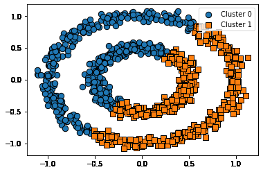
GMM
# GMM으로 make_circles( ) 데이터 셋을 클러스터링 수행.
from sklearn.mixture import GaussianMixture

gmm = GaussianMixture(n_components=2, random_state=0)
gmm_label = gmm.fit(X).predict(X)
clusterDF['gmm_cluster'] = gmm_label

visualize_cluster_plot(gmm, clusterDF, 'gmm_cluster', iscenter=False)
DBSCAN
# DBSCAN으로 make_circles( ) 데이터 셋을 클러스터링 수행.
from sklearn.cluster import DBSCAN

dbscan = DBSCAN(eps=0.2, min_samples=10, metric='euclidean')
dbscan_labels = dbscan.fit_predict(X)
clusterDF['dbscan_cluster'] = dbscan_labels

visualize_cluster_plot(dbscan, clusterDF, 'dbscan_cluster', iscenter=False)

PREVIOUS경제