Matplotlib
기초
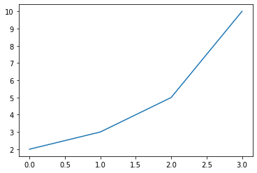
import matplotlib.pyplot as plt

plt.plot([2, 3, 5, 10])     # list, tuple, numpy 같은 Array 입력받을 수 있음
plt.show()  # x 값은 기본적으로 [0, 1, 2, 3]이 됨
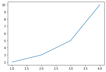
import matplotlib.pyplot as plt

plt.plot([1, 2, 3, 4], [2, 3, 5, 10])
plt.show()
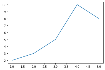
import matplotlib.pyplot as plt

data_dict = {'data_x': [1, 2, 3, 4, 5], 'data_y': [2, 3, 5, 10, 8]}

plt.plot('data_x', 'data_y', data=data_dict)        # dictionary와 연계가능. 먼저 dictionary를 제공하고 그것의 Key를 호출한다 생각하면 편함
plt.show()
축 글씨 및 길이 지정
레이블 여백, 폰트 설정, 위치 설정
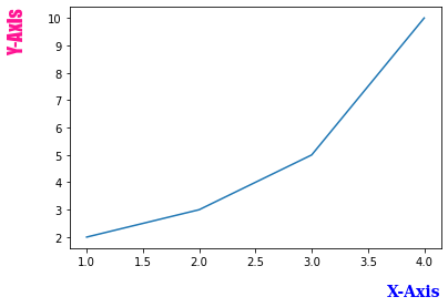
import matplotlib.pyplot as plt

font1 = {'family': 'serif',
         'color': 'b',
         'weight': 'bold',
         'size': 14
         }

font2 = {'family': 'fantasy',
         'color': 'deeppink',
         'weight': 'normal',
         'size': 'xx-large'
         }

plt.plot([1, 2, 3, 4], [2, 3, 5, 10])
plt.xlabel('X-Axis', labelpad=15, fontdict=font1, loc='right')
plt.ylabel('Y-Axis', labelpad=20, fontdict=font2, loc='top')
plt.show()
여러 그래프 표시
- plt.subplot, plt.subplots 2가지 방식이 있음
- 구조도 이해
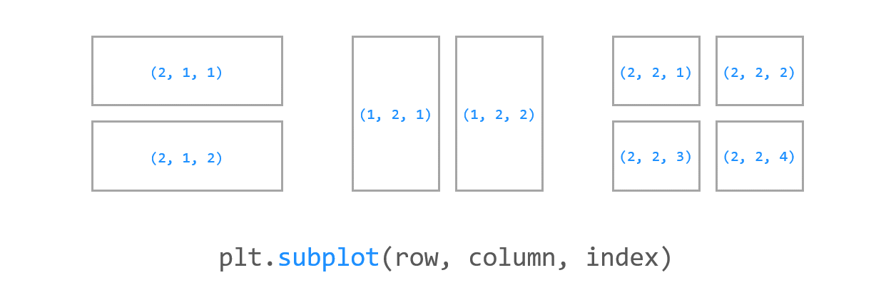
plt.subplot
import numpy as np
import matplotlib.pyplot as plt

x1 = np.linspace(0.0, 5.0)
x2 = np.linspace(0.0, 2.0)

y1 = np.cos(2 * np.pi * x1) * np.exp(-x1)
y2 = np.cos(2 * np.pi * x2)

plt.subplot(2, 1, 1)                # nrows=2, ncols=1, index=1 / 행렬 모양을 지정하고, 인덱스 지정한다 생각하면 되겠네
plt.plot(x1, y1, 'o-')
plt.title('1st Graph')
plt.ylabel('Damped oscillation')

plt.subplot(2, 1, 2)                # nrows=2, ncols=1, index=2
plt.plot(x2, y2, '.-')
plt.title('2nd Graph')
plt.xlabel('time (s)')
plt.ylabel('Undamped')

plt.tight_layout()
plt.show()
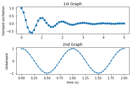
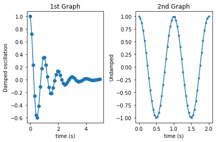
fig , (ax1, ax2, ax3) = plt.subplots(figsize=(14,4), ncols=3) # 이런식으로 써서도 접근 가능하다
import numpy as np
import matplotlib.pyplot as plt

x1 = np.linspace(0.0, 5.0)
x2 = np.linspace(0.0, 2.0)

y1 = np.cos(2 * np.pi * x1) * np.exp(-x1)
y2 = np.cos(2 * np.pi * x2)

plt.subplot(1, 2, 1)                # nrows=1, ncols=2, index=1
plt.plot(x1, y1, 'o-')
plt.title('1st Graph')
plt.xlabel('time (s)')
plt.ylabel('Damped oscillation')

plt.subplot(1, 2, 2)                # nrows=1, ncols=2, index=2
plt.plot(x2, y2, '.-')
plt.title('2nd Graph')
plt.xlabel('time (s)')
plt.ylabel('Undamped')

plt.tight_layout()
plt.show()
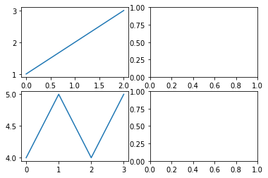
plt.subplots
fig, axes = plt.subplot(1, 2)
axes[0].plot([1,2,3])
axes[1].plot([4,5,4,5])
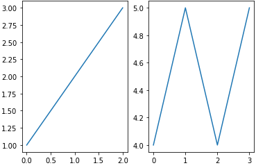
fig, axes = plt.subplots(2,2)       # fig: picture를 담은 객체, axes: 각각의 그래프를 Array 형태로 담음
axes[0][0].plot([1,2,3])
axes[1][0].plot([4,5,4,5])
[<matplotlib.lines.Line2D at 0x1edc5b10460>]
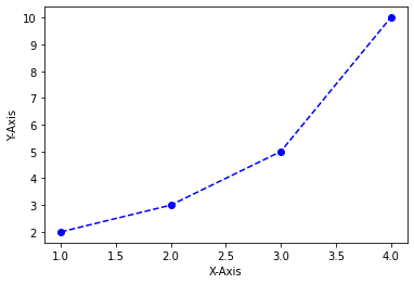
마커 지정하기
- 지정할 수 있는 것들
import matplotlib.pyplot as plt

# plt.plot([1, 2, 3, 4], [2, 3, 5, 10], 'bo-')    # 파란색 + 마커(o는 동그란거) + 실선
plt.plot([1, 2, 3, 4], [2, 3, 5, 10], 'bo--')     # 파란색 + 마커(o는 동그란거) + 점선
plt.xlabel('X-Axis')
plt.ylabel('Y-Axis')
plt.show()
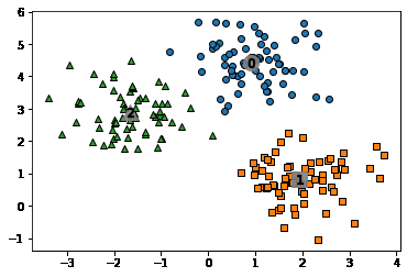
scatter를 활용해 군집화 데이터 표현하기
import matplotlib.pyplot as plt
%matplotlib inline

clusterDF['meanshift_label']  = cluster_labels
centers = meanshift.cluster_centers_
unique_labels = np.unique(cluster_labels)
markers=['o', 's', '^', 'x', '*']

for label in unique_labels:
    label_cluster = clusterDF[clusterDF['meanshift_label']==label]
    center_x_y = centers[label]
    # 군집별로 다른 마커로 산점도 적용
    plt.scatter(x=label_cluster['ftr1'], y=label_cluster['ftr2'], edgecolor='k', marker=markers[label] )

    # 군집별 중심 표현
    plt.scatter(x=center_x_y[0], y=center_x_y[1], s=200, color='gray', alpha=0.9, marker=markers[label])
    plt.scatter(x=center_x_y[0], y=center_x_y[1], s=70, color='k', edgecolor='k', marker='$%d$' % label)

plt.show()
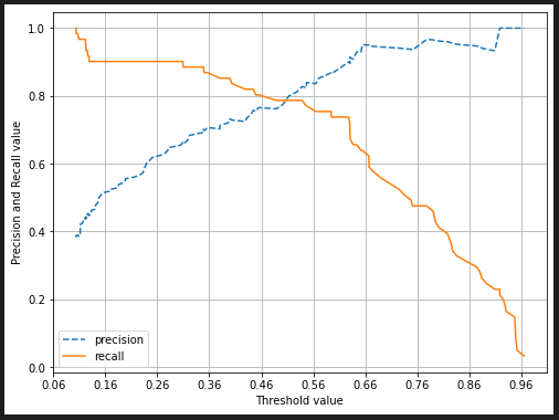
precision_recall_curve 그리기
from sklearn.metrics import precision_recall_curve

# 레이블 값이 1일때의 예측 확률을 추출
pred_proba_class1 = lr_clf.predict_proba(X_test)[:, 1]

# 실제값 데이터 셋과 레이블 값이 1일 때의 예측 확률을 precision_recall_curve 인자로 입력
precisions, recalls, thresholds = precision_recall_curve(y_test, pred_proba_class1 )
print('반환된 분류 결정 임곗값 배열의 Shape:', thresholds.shape)
print('반환된 precisions 배열의 Shape:', precisions.shape)
print('반환된 recalls 배열의 Shape:', recalls.shape)

print("thresholds 5 sample:", thresholds[:5])
print("precisions 5 sample:", precisions[:5])
print("recalls 5 sample:", recalls[:5])

#반환된 임계값 배열 로우가 147건이므로 샘플로 10건만 추출하되, 임곗값을 15 Step으로 추출.
thr_index = np.arange(0, thresholds.shape[0], 15)
print('샘플 추출을 위한 임계값 배열의 index 10개:', thr_index)
print('샘플용 10개의 임곗값: ', np.round(thresholds[thr_index], 2))

# 15 step 단위로 추출된 임계값에 따른 정밀도와 재현율 값
print('샘플 임계값별 정밀도: ', np.round(precisions[thr_index], 3))
print('샘플 임계값별 재현율: ', np.round(recalls[thr_index], 3))

import matplotlib.pyplot as plt
import matplotlib.ticker as ticker
%matplotlib inline

def precision_recall_curve_plot(y_test , pred_proba_c1):
    # threshold ndarray와 이 threshold에 따른 정밀도, 재현율 ndarray 추출.
    precisions, recalls, thresholds = precision_recall_curve( y_test, pred_proba_c1)

    # X축을 threshold값으로, Y축은 정밀도, 재현율 값으로 각각 Plot 수행. 정밀도는 점선으로 표시
    plt.figure(figsize=(8,6))
    threshold_boundary = thresholds.shape[0]
    plt.plot(thresholds, precisions[0:threshold_boundary], linestyle='--', label='precision')
    plt.plot(thresholds, recalls[0:threshold_boundary],label='recall')

    # threshold 값 X 축의 Scale을 0.1 단위로 변경
    start, end = plt.xlim()
    plt.xticks(np.round(np.arange(start, end, 0.1),2))

    # x축, y축 label과 legend, 그리고 grid 설정
    plt.xlabel('Threshold value')
    plt.ylabel('Precision and Recall value')
    plt.legend(); plt.grid()
    plt.show()

precision_recall_curve_plot( y_test, lr_clf.predict_proba(X_test)[:, 1] )
Seaborn
Kaggle 머신러닝 대표 데이터인 Titanic 사용
Seaborn은 Matplot을 기반한 라이브러리지만 사용자가 더 쓰기 용이하도록 DataFrame을 바로 쓸 수 있도록 data parameter를 지원해주며, 각종 통계 지표들을 훨씬 직관적으로 쓸 수 있게 해준다.
barplot
x, y의 dimension을 맞춰서 간단하게 사용 가능하다.
x, y중 하나는 numeric variable, 다른 하나는 categorical variable 이여야 한다. 이를 활용해 vertical bar plot을 만들거나, horizontal bar plot을 만들 수 있다. (x, y에 들어가는 값만 서로 바꿔주면 됨)
sns.barplot(x=['male', 'female'], y = [7.1, 8.2])
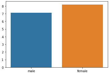
barplot의 강력함은 groupby 연산과, mean 연산을 한번에 해준다는 점이다.
tips_df.head()
   total_bill   tip     sex smoker  day    time  size
0       16.99  1.01  Female     No  Sun  Dinner     2
1       10.34  1.66    Male     No  Sun  Dinner     3
2       21.01  3.50    Male     No  Sun  Dinner     3
3       23.68  3.31    Male     No  Sun  Dinner     2
4       24.59  3.61  Female     No  Sun  Dinner     4
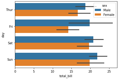
sns.barplot(x='day', y='total_bill', hue='sex', data=tips_df);
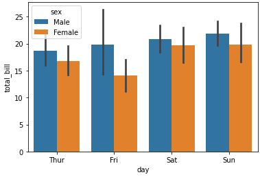
day를 기준으로 group된 데이터들 중 각 day별 total_bill의 평균값을 계산해서 한번에 보여준다.
가운데 검은선의 길이가 데이터의 퍼진 정도를 나타낸다. 금요일이 변동량이 가장 큼을 의미한다.
hue를 활용한 막대그래프 구체화
hue 인자를 통해 bar(막대기)를 어떻게 세세하게 나눌것인지 결정한다.
sns.barplot(x='size', y='total_bill', hue='sex', data=tips_df);
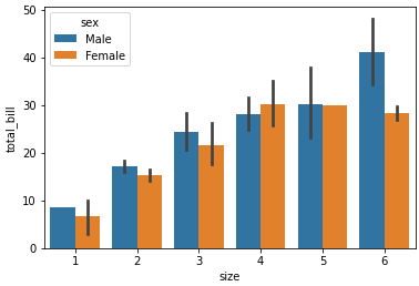
위 그래프는 다음의 코드를 보면 바로 이해가 갈것이다.
tips_df.groupby(['day', 'sex']).mean()
| total_bill | tip | size | ||
|---|---|---|---|---|
| day | sex | |||
| Thur | Male | 18.714667 | 2.980333 | 2.433333 |
| Female | 16.715312 | 2.575625 | 2.468750 | |
| Fri | Male | 19.857000 | 2.693000 | 2.100000 |
| Female | 14.145556 | 2.781111 | 2.111111 | |
| Sat | Male | 20.802542 | 3.083898 | 2.644068 |
| Female | 19.680357 | 2.801786 | 2.250000 | |
| Sun | Male | 21.887241 | 3.220345 | 2.810345 |
| Female | 19.872222 | 3.367222 | 2.944444 |
horizontal bar plot
Numerical -> Categorial 변경
여러 시각화를 하다보면, duplicated로 인한 문제나 categorical 데이터 타입을 사용해야 하는 등의 필요조건이 자주 발생한다.
아래와 같은 코드로 Numerical -> Categorical로 변경이 가능하다.
# 입력 age에 따라 구분값을 반환하는 함수 설정. DataFrame의 apply lambda식에 사용.
def get_category(age):
    cat = ''
    if age <= -1: cat = 'Unknown'
    elif age <= 5: cat = 'Baby'
    elif age <= 12: cat = 'Child'
    elif age <= 18: cat = 'Teenager'
    elif age <= 25: cat = 'Student'
    elif age <= 35: cat = 'Young Adult'
    elif age <= 60: cat = 'Adult'
    else : cat = 'Elderly'

    return cat

# 막대그래프의 크기 figure를 더 크게 설정
plt.figure(figsize=(10,6))

#X축의 값을 순차적으로 표시하기 위한 설정
group_names = ['Unknown', 'Baby', 'Child', 'Teenager', 'Student', 'Young Adult', 'Adult', 'Elderly']

# lambda 식에 위에서 생성한 get_category( ) 함수를 반환값으로 지정.
# get_category(X)는 입력값으로 'Age' 컬럼값을 받아서 해당하는 cat 반환
titanic_df['Age_cat'] = titanic_df['Age'].apply(lambda x : get_category(x))
sns.barplot(x='Age_cat', y = 'Survived', hue='Sex', data=titanic_df, order=group_names)
titanic_df.drop('Age_cat', axis=1, inplace=True)
pairplot
DataFrame을 구성하는 Numerical column들에 대한 상관관계나 Numerical column 들과 Categorical column 하나로 분류적 특성을 바로 확인할 수 있다.
flowers_df.head()
| sepal_length | sepal_width | petal_length | petal_width | species | |
|---|---|---|---|---|---|
| 0 | 5.1 | 3.5 | 1.4 | 0.2 | setosa |
| 1 | 4.9 | 3.0 | 1.4 | 0.2 | setosa |
| 2 | 4.7 | 3.2 | 1.3 | 0.2 | setosa |
| 3 | 4.6 | 3.1 | 1.5 | 0.2 | setosa |
| 4 | 5.0 | 3.6 | 1.4 | 0.2 | setosa |
flowers_df.info()
tp = flowers_df.iloc[:, :4]
sns.pairplot(flowers_df, hue='species')
<class 'pandas.core.frame.DataFrame'>
RangeIndex: 150 entries, 0 to 149
Data columns (total 5 columns):
 #   Column        Non-Null Count  Dtype
---  ------        --------------  -----
 0   sepal_length  150 non-null    float64
 1   sepal_width   150 non-null    float64
 2   petal_length  150 non-null    float64
 3   petal_width   150 non-null    float64
 4   species       150 non-null    object
dtypes: float64(4), object(1)
memory usage: 6.0+ KB
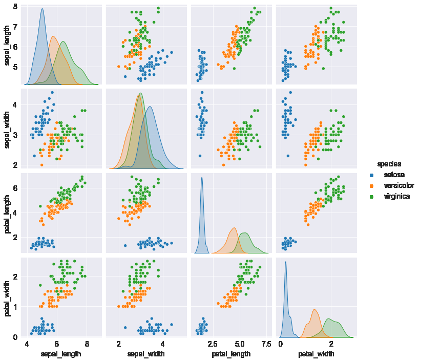
hue가 없어도 색깔이 모두 파란색인 동일한 그래프가 출력된다. 점은 x좌표, y좌표만 있으면 찍히기 때문이다. (처음에 왜 hue가 없는데도 그림이 동일한지 의아했음). hue가 접목이되면 여기 그래프에선 색깔로 구분을 했지만, 원래는 z축인 3차원 그래프로 표현해야 하는 데이터이다.
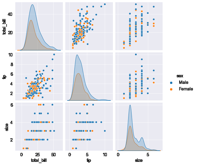
sns.pairplot(tips_df, hue='sex');
Matplot & Seaborn 같이 활용하기
HeatMap 그리기
2차원 데이터를 시각화하는데 사용된다.
flights_df = sns.load_dataset("flights")
flights_df.head()
| year | month | passengers | |
|---|---|---|---|
| 0 | 1949 | Jan | 112 |
| 1 | 1949 | Feb | 118 |
| 2 | 1949 | Mar | 132 |
| 3 | 1949 | Apr | 129 |
| 4 | 1949 | May | 121 |
flights_df.info()
<class 'pandas.core.frame.DataFrame'>
RangeIndex: 144 entries, 0 to 143
Data columns (total 3 columns):
 #   Column      Non-Null Count  Dtype
---  ------      --------------  -----
 0   year        144 non-null    int64
 1   month       144 non-null    category
 2   passengers  144 non-null    int64
dtypes: category(1), int64(2)
memory usage: 2.9 KB
Headmap을 위한 2차원 데이터를 만들기 위해 Pandas.DataFrame.pivot 메소드를 사용한다.
flights_df.pivot('month', 'year', 'passengers') # row 방향을 month로 구성
                                                # column 방향을 year로 구성
                                                # 그 안의 value를 passengers로 구성
| year | 1949 | 1950 | 1951 | 1952 | 1953 | 1954 | 1955 | 1956 | 1957 | 1958 | 1959 | 1960 |
|---|---|---|---|---|---|---|---|---|---|---|---|---|
| month | ||||||||||||
| Jan | 112 | 115 | 145 | 171 | 196 | 204 | 242 | 284 | 315 | 340 | 360 | 417 |
| Feb | 118 | 126 | 150 | 180 | 196 | 188 | 233 | 277 | 301 | 318 | 342 | 391 |
| Mar | 132 | 141 | 178 | 193 | 236 | 235 | 267 | 317 | 356 | 362 | 406 | 419 |
| Apr | 129 | 135 | 163 | 181 | 235 | 227 | 269 | 313 | 348 | 348 | 396 | 461 |
| May | 121 | 125 | 172 | 183 | 229 | 234 | 270 | 318 | 355 | 363 | 420 | 472 |
| Jun | 135 | 149 | 178 | 218 | 243 | 264 | 315 | 374 | 422 | 435 | 472 | 535 |
| Jul | 148 | 170 | 199 | 230 | 264 | 302 | 364 | 413 | 465 | 491 | 548 | 622 |
| Aug | 148 | 170 | 199 | 242 | 272 | 293 | 347 | 405 | 467 | 505 | 559 | 606 |
| Sep | 136 | 158 | 184 | 209 | 237 | 259 | 312 | 355 | 404 | 404 | 463 | 508 |
| Oct | 119 | 133 | 162 | 191 | 211 | 229 | 274 | 306 | 347 | 359 | 407 | 461 |
| Nov | 104 | 114 | 146 | 172 | 180 | 203 | 237 | 271 | 305 | 310 | 362 | 390 |
| Dec | 118 | 140 | 166 | 194 | 201 | 229 | 278 | 306 | 336 | 337 | 405 | 432 |
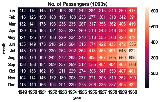
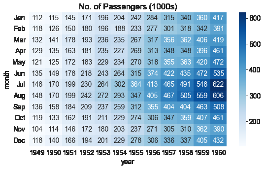
flights_df = sns.load_dataset("flights").pivot("month", "year", "passengers") #pivot은 여러 분류로 섞인 행 데이터를 열 데이터로 회전시킴
flights_df는 한 달에 한 행, 한 열이 있는 matrix로, 한 해 중 특정 달에 공항을 방문한 승객의 수를 나타낸다.
sns.heatmap함수를 사용하여 공황을 방문하는 승객의 수를 시각화 할 수 있다.
import matplotlib.pyplot as plt

plt.title("No. of Passengers (1000s)")
sns.heatmap(flights_df);

위 그래프의 밝은 색상은 더 많은 이용객이 방문했음을 의미한다. 그래프를 통해 2 가지를 추론이 가능하다.
- 7~8월경에 공항 이용객이 높다.
- 각 달의 공항 이용객은 해마다 증가하는 경향이 있다.
각 블록에 annot=True를 설정하여 실제 값을 표시 할 수 있고 cmap 인자로 팔레트의 색을 바꿀 수 있다.
plt.title("No. of Passengers (1000s)")
sns.heatmap(flights_df, fmt="d", annot=True);
plt.title("No. of Passengers (1000s)")
sns.heatmap(flights_df, fmt="d", annot=True, cmap='Blues');
히스토그램으로 데이터 분포 형태 살펴보기
DataFrame.hist()  # target 데이터 같은게 들어있는 DataFrame이라고 가정
sns.distplot(DataFrame)  # 이걸로도 가능. (이게 더 이쁜듯)
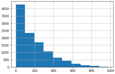
- hist()처럼 아무 인자도 주지 않았을 경우 x축이 DataFrame 값임(즉 위 그림에선 0 ~ 200인 값이 대략 4200개 있다는 것)
- 위 그림은 데이터가 초반부에 치우쳐 있는 모습